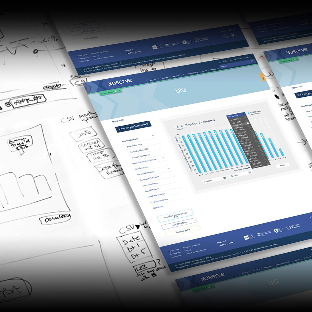
In addition to analysing existing department or team workflows, we identified how Xoserve was sharing raw UIG data in spreadsheets with its customers.
While this approach gave the customers the data they needed, it wasn’t user-friendly, and the data shared was difficult to read. We proposed that the UIG data could be displayed in interactive graphs on a dedicated section of its website. When our concept was signed off by the Xoserve team, we set to work to make this a reality. We had to work closely with its IT and security teams to create a secure process for the data to be sent from internal systems to a server location to allow it to be collated and displayed in the graphs.
Once we were able to do this we designed and developed the interactive UIG graphs and introduced functionalities that allowed users to refine the data based on date ranges and calculate averages. This change gave Xoserve’s customers a platform to easily view and understand the data, which helped them save time and effort trying to make sense of it manually.
Start your project


